My quilts are primarily pictorial, making it easy to pull some of the concepts associated with colour and composition into projects. What is universal though, is that no matter what we piece or patch together, colour is experienced with the eyes and the heart. What I want colour to say is as important to me as how I want it to be seen.
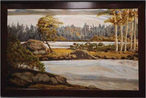
Our latest pattern release, The Last Small Gift draws on some of the lessons in colour and composition I learned from a painting I did a few years back. One Swaying Being depicted a windswept juniper struggling to survive in a northern forest. The idea of a tired Santa stopping at the treeline for a ‘mug up’ enroute back to the North Pole on Christmas morning asked for some of the same restraint and stillness.

The boreal forest is not just trees; it is very much an ecological patchwork of bogs and fens, rivers and streams with added richness at their overlapping seams. From a distance, it looks calm and stable. Up close though, even the most well adapted struggle to survive in the short growing season and the long winter. This fact made it a good backdrop for both the painting and the wall hanging.
The painting had marked a point where I knew my intuitive understanding of composition and colour wasn’t enough. I took myself back to ‘school’: read what I could on those subjects, looked for inspiration in other work and observed the woods as I drove about my business. I experimented on a small scale to give myself license to ‘fail it up’ and learn from my mistakes.
I have a colour bias towards blue but the painting ended up being the first work I did primarily in yellows. No other colour seems to embody struggle and calm at the same time. Composition wise, strong horizontal lines reinforce the sense of solace. I opted to downplay the blue of the water in the painting, the water and sky are in values and hues that let the yellow say what it needed to say.
Here is what I took from making the painting into creating The Last Small Gift:
- I inverted the yellow and blue, wanting what blue there was to be reminiscent of dawn. A little hopeful blue poking out between the trees in both the painting and the quilt hints at a rejuvenation.
- The blue also acts to cool down the Christmas red of Santa’s suit. Red is a common flag colour for good reason, it asks for attention. I wanted to downplay its power here.
- The blue alone wasn’t going to stop red from stealing the show; some earthy yellows, greys, greens and browns help keep the project grounded and calm, as it did in the painting. Both projects also rely on neutrals to round out the story and let the colours speak.
- The strong horizontal banding in the foreground echos Santa’s outstretched arm and creates the sense of repose so central to the story.

If you are struggling picking a colour scheme for a project take yourself back to colour school and review colour theory. It will not replace your innate sense of what works and what doesn’t, it will only reinforce it. What colour tells the story you have in your mind? Think about any bias you may have towards a particular palette and deliberately veer away from it for a project or two. Pull fabrics from your stash and play around with combinations, create small bundles and let them sit in your sewing room until you are sure they work, or don’t. Limit your palettes or expand them, scheme until you have a scheme you like. And don’t ever be afraid to ‘fail it up’.